Creative Design
For the past decade graphic design has been refining and defining an age of minimalist aesthetic. Dominated by the pursuit of the sleek, the slimline, the stripped back, a race to be the most minimal has seen everything from tech to homewares define taste as a lack of extraneous detail. It may seem that this has gone beyond trend to become the norm, but 2018 is coming to decry that idea. Get ready for the era of the extra – Maximalism is back.
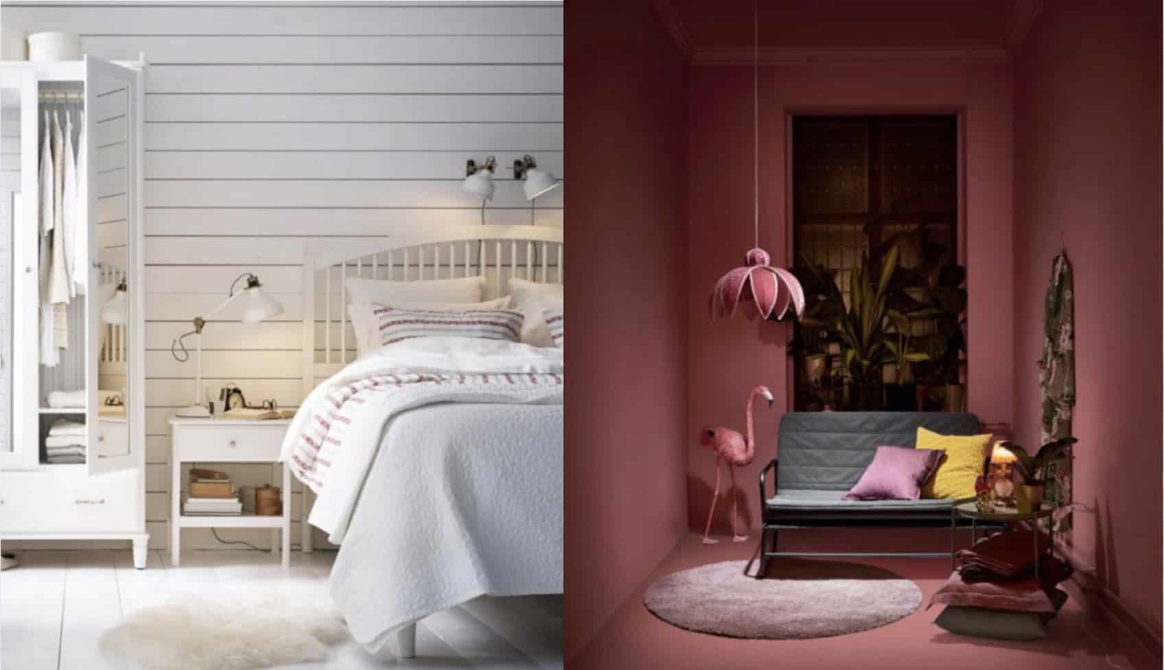
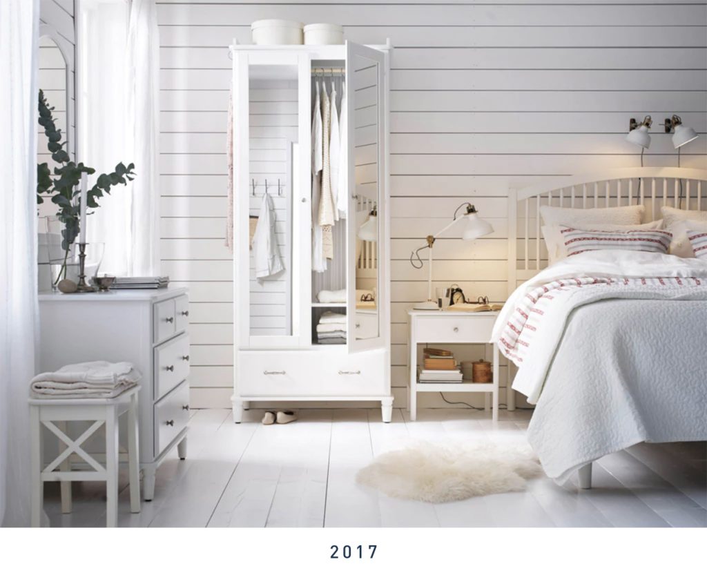
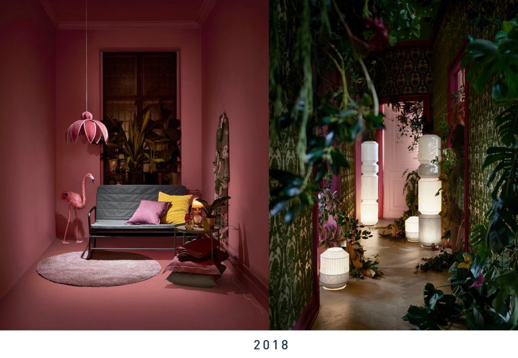
You only need to look to the design trends of the past few years to see what the future of design is railing against. Watch how apple has pared back every little detail from their once-rainbow logo-clad boldness to a greyscale, palatial genius bar experience. Or take a glance at homeware’s recent obsession with hygge – the neutral, natural cosiness of Scandinavian design. In an earth-shattering reaction this particular trend’s saturation, Swedish homeware giants IKEA are overhauling their entire brand ID. A move designed to pre-empt the inevitable, and a savvy one we predict.
Even the ubiquity of fonts like Helvetica and Arial fits in this sans serif, flaw free modernism that is simply unavoidable.
It’s in response to this careful, considered, conscious design living that Maximalism rails. No more Marie Kondo, it’s back to instinctive blending of urban colours, art culture clashes and daring to add extra. Don’t wait and ask if something “sparks joy”, the future of design is about visuals where there’s no question about how it makes the viewer feel.
So what does this mean for the world of design? Our creative team predict a return of eclecticism in 2018. That means textural Maximalism in image manipulation, colour palettes where more is more and even font choices that shock and engage the eye. Purposeful flaws are about to make a comeback, as the perfection of streamlined design becomes a bore to the eye of the consumer.
Even in photographic manipulation and design, the effects of Maximalism in texture and colour usage can be seen. Far behind lags the humble filter, with instead a return to effects like double exposure and faux-glitch style manipulations in photographic post-production.
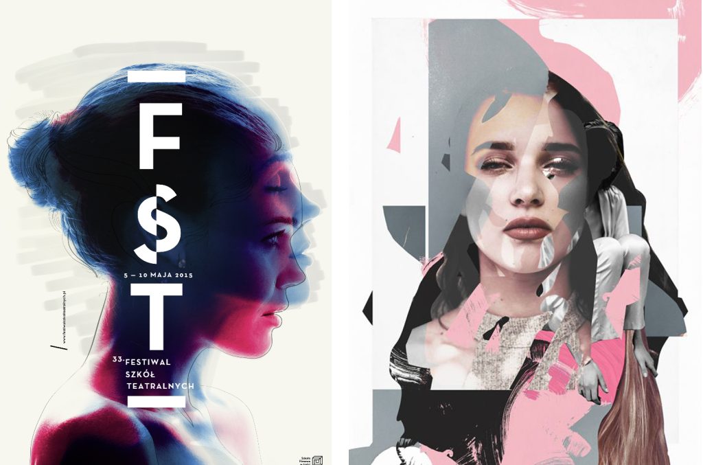
Where colours are focused in imagery, more is more once again. Gone are the genteel pastels and greyscale, in are primaries and solid shades bordering on neon. Think tropical cocktail glass, not elegant interiors.
How can we, as trend aware designers and creatives, take this to the retail sphere? In all design, from art to advertising, perpetual motion is our lifeblood. As we enter 2018, we’ll marry trends to clients and push even the smallest of details further with each new project. How will you benefit? Get in touch.
Credit: Model used in artwork https://www.jadoremodels.co.uk/model/shokz/


